Wednesday, December 7, 2011

User-centered design: What are major features of workplace documents that display user-centered design? Offer an example of a workplace document.

http://1.bp.blogspot.com/_oyEmjicXz0Q/TKsPmnvRyhI/AAAAAAAAAQk/UiBEE0IHKvg/s1600/AirplaneSafetyCard2.jpg

User Center Design, or UCD, is a process by which a design in which is sensible to all the people who will use the product. Designers make sure they are aware that the audience is their number one importance. The design process goes through different steps in order to meet the audience’s requirements: Analysis Phase, Design Phase, Implementation Phase and Deployment Phase. In the Analysis Phase, the designer investigates what this document must include, such as important information and the message it’s trying to convey. In this phase, the designer looks at different user scenarios. In the Design Phase, the ideas come into play. Design concepts are thought of and prototypes are tested. In the Implementation Phase, usability test are performed and the design is implemented. In the Deployment Phase, the designer receives feedback from the user.

The document above is a based on a user-centered design. It is an airline safety card. This safety card shows what you should do in care of an emergency. Since many people travel from all different places, there are no words on this document. The pictures serve as a universal language. If this card was given to different people who speak different languages, the message would still get across. This is a successful UCD document.

http://www.upassoc.org/usability_resources/about_usability/what_is_ucd.html

Document Design: Find a government document that is intended to present information but has such poor design

http://www.incometaxindia.gov.in/Archive/Filing_Your_Tax_Return.pdf

Tax return forms are important forms to fill out for people in many countries. Taxes are given to the government, however, many people qualify for tax returns. A tax return is a document indicating the annual income and circumstance of a family that is used by the government in order to give citizens back money they could use. There are often many people who do not understand how to fill out a tax return form. There are instructions but the instructions may be a bit confusing to many people.

The image above is the cover of a packet that explains to a person how to fill out a tax return form. This is a government document that is read by many people. This particular instructions manual is for filling out a Tax Return form in New Delhi. This document is a boring document. There are no colors or images in order to make reading this easy. It is straight to the point. This text is word-heavy which does not appeal to people. Although this is a government document, there is no need for this to be dull and borings. Many people have to read this document and understand it in order to fill out their tax return forms. Why make it hard on people? If people do not read this document and do not fill out the f but are eligible for a tax return, they let the government keep the money they could have gotten back. This government document does a good job at not keeping the attention of readers and making this text hard and difficult to read by being text heavy and not appealing to the eye.

Color Theory: Choose a fast-food logo that conforms to the idea about primary colors and explain

http://www.adrants.com/images/burger-king_logo.jpg

The primary colors are Red, Yellow and Blue. These colors are said to give off a sense of urgency or quickness. Many fast food joints have logos that contain the primary colors. The image above is the logo of a famous fast food joint called Burger King. This logo contains all three primary colors in the logo. This logo looks like a burger itself. The two yellow portions of this logo symbolize the bread while the words in bold red, “BURGER KING,” takes the place of the insides of a burger, namely the meat, lettuce, tomatoes, onions, pickles mayonnaise, ketchup and whatever else this burger may contain. The blue semi-circle is there to show that the burger is contained and secure. The blue semi-circle is thicker at the bottom then fades out as it reaches the top of the logo.

Fast food joints are found on major streets in cities in which many passersby are able to see and access with ease. The logos contain bright, well known colors which catch the eye of many. The primary colors are bright and fit well together, as this logo for Burger King shows. The sense of urgency is given off my these colors with represent the “fast” aspect in the fast food joint. When attempting to find some place to eat something fast, driving down a main street in a town or city and looking at the logos on the site of the street is a good way to see various fast food joints. The logos are fun-looking and because of their colors, they are easy to point out.

Remediation: Choose a “new media” form of today and, with an image, reveal how it “refashion(s) older media”

http://www.applewp.com/wp-content/uploads/2011/04/ipod-History.jpg

Music is an art form that has been around through the centuries. From the beginning, live music was the only way to access new music. Later on, the record player was invented in order to play vinyl records. A record player, also known as a phonograph, was used in the early 20th century in order to record and replay music. The records could hold about 25 minutes of music but could be flipped over and hold more music. Back when record players were used, this was a great amount of music.

Today, music is everywhere. As phonographs were used back in the day, iPods are the new trend. An iPod is a device that plays music as well as other features. IPods, unlike record albums, are able to hold thousands of songs. With the increased amount of technology today, iPods have the capacity of holding music more music than was ever thought possible back in the day of records. There are different types of iPods. On an iPod Touch, for example, you are able to play music, take pictures, read books and play games. This device is taking the place of many other forms of media such as a phonograph and a hard copy book. As years progress, technology finds new ways of replacing old media with new media.

Website Ethos: Using a website that is widely accepted as credible, point on the site design or citation flaws that cause it to have poor ethos

http://ricklax.com/files/About.com_logo%2Bcopy.jpg

The internet has a variety of uses. People can search what things are, how to do a certain thing as well as countless other questions. If a search engine, like Google or Yahoo, is used, the first “hits” are the most credible websites. One of this sites that often appears is called About.com. This site offers various pages on just about anything you could imagine. From “Setting Up a Creative Party Table” to “How to Run on a Treadmill,” the list is endless. This website is thought of as being credible. Many people get their information off of About.com, but is all of the information that is posted true?

When you read an article on About.com, it all seems credible. One thing most people fail to question is where is the presented information coming from? About.com is a site where writers can express their knowledge on a certain topic. None of the articles are cited, however. All the information that is presented seems to simply be coming from the author’s heads. Do all of the authors know everything about the topic they are writing about? About.com is a credible website that contains articles that are not properly cited. This displays poor ethos.

Photographic portrayals of violence: Investigate the ethical transgression or ethical reserve that a particular photo displays

Images containing violence are not ones that are appropriate for all viewers. This image was taken in Egypt during the 2011 protests. This image depicts 3 civilians attempting to avoid getting hit by sticks held by government officials. Other civilians attempt to avoid confrontation with the officers as seen in the upper left hand corner of the image where it seems that civilians are attempting to get away from the officers.

Government officials, including police officers and soldiers from the army are supposed to represent people of good, ethical standing in society. This image does the opposite for the officials shown in this image. The badges, uniforms and equipment are signs that these people are government officials. This image puts them in a bad light. Although the story behind this image is unclear, it is unknown who are the “bad guys.” In the image, the officers raising their sticks, getting ready to strike the civilians, seem like the ones that are in the wrong. On the other hand, since Egyptian society is different, these officers may simply be showing discipline to these civilians; the act of violence in this form may be accepted. From an American view, however, there is an ethical transgression by the officers pictured in this image.

Your favorite animated TV show: Provide screenshots and explain its particular appeal to you as well as its social commentary.

http://cdn.babble.com/family-style/files/2010/12/rugrats1.gif

One of my favorite television shows from my childhood is the Rugrats. This show is about a friendship of babies and toddlers. The main characters are Tommy Pickles (front center), Chuckie Finster, Lil Deville, Phil Deville and Angelica Pickles(from left to right in back). These friends always find some sort of adventure. From walking through a hot desert with no water and seeing a mirage to being grown up in a business setting, their imaginations are bigger than any babies their age. Each baby has their own different personality. Tommy is the adventurous one, Chuckie is the “scaredy cat,” Phil and Lil are always willing to try anything new and Angelica is the bossy one. This show is one for children and older kids alike.

On a social aspect, one big issue that is dealt with here is a sort of dictatorship. Angelica, Tommy’s older cousin, is a toddler and believes she is better than the babies. She often pushes the babies around and tells them what to do. Since Angelica is older, the babies look up to her and do whatever she tells them. There are, however, instances where the babies go against what Angelica says and overrule her. This type of behavior is found in children every day. Power roles are played every day in society. Seniority is found everywhere: from the Rugrats to people in everyday life.

Informational graphics: Find a graphic from that you think is too complicated and obfuscates the data rather than clarifies it.

http://xkcd.com/980/huge/#x=-6720&y=-4448&z=2

This image above is an infographic about money. The title of this infographic is “Money: A chart of almost all of it, where it is, and what it can do.” This image is very dense with information. A small scale version of this infographic is seen above. The website that this was obtained from (see hyperlink below image) contains a zoom feature in order to fully view the infographic at a readable size.

This infographic is split into five different seconds: dollars, thousands, millions, billions and trillions. Within these sections, there are smaller seconds with individual infographics. Each of the large seconds is sized down and pictured on the next biggest section in order to show the magnitude of each section and how it compares to the next section. Much of the information in this infographic runs together due to the lack of whitespace. Although the sections are color coordinated, the graphics are still difficult to read.

Infographics are supposed to use images in order to present heavy information in a clear and concise way. This particular infographic does the opposite. There is a lot of information displayed on this image which makes things cluttered and hard to read and comprehend. Although money can be complicated, this infographic is complex as well.

Film title/credits: Offer a screenshot(or more) of titles/credits from a film that you think suit the film well. Explain.

(photos taken by Christina Nevarez)

The closing credits of the Pixar movie, Monsters Inc., give insight to the company within the movie, Monsters Incorporated. This movie is about a company named Monsters Incorporated that is located in the city of Monstropolis. Monsters Incorporated is the city’s power company. The screams of human children are what give power to the city of Monstropolis. In this movie, monsters are hired and trained to sneak into human children’s rooms through their closet doors and frighten the children in order to produce scream power. The photographs above are screenshots of the ending credits. In the upper right hand picture, it shows a normal child’s closet while the other images show the monsters in the closet. These images are what Monsters Incorporated is based on.

In the movie, the monsters come in all different shapes and sizes. All the monsters are different. This is portrayed in the closing credits of the movie. Because every door leads to a different child’s room in the movie, every door is different. This can also be seen in the credits. This movie is a children’s movie and the font that is used in the closing credits gives a playful feel to it. The titles of the directors and produces are in a more serious sans serif font while their actual names are in a more fun sans serif. This gives the credits a professional yet fun feel to them.

Typography: Choose a computer font that you like. With an example, explain it carefully and analyze its strengths.

Arial Narrow

abcdefghijklmnopqrstuvwxyz

ABCDEFGHIJKLMNOPQRSTUVWXYZPublish Post

Arial Narrow is a font that appeals to me. My handwriting is similar to this. I write narrow and long, or tall, letters. Arial Narrow is a sans serif font that has very minimal tracking, or spacing between the letters. The font, as the name indicates, seems narrow due to the minimal kerning. This font, unlike many sans serifs, is more professional than others. It provides high readability but does not give off a “boring” look. Arial Narrow does not put strain on the eyes. It does not have “swirly” or “curly” letters that many serifs have. This font is concise.

When the point sizes of this font are decreased, the readability decreases. This is the one main weakness. This font is legible and at bigger point sizes which is why it is used for captions or headings on websites. Many other sans serifs are used for these as well as for titles of movies or titles on books. Many street signs and warning signs use sans serif fonts, like Arial Narrow, so the viewer does not get distracted with the serif’s (Lester).

Lester, Paul Martin. Visual Communication: Images with Messages. Belmont: Thompson Wadsworth, 2005. 144.

Memorandum

To: Dr. Newmark

From: Christina Nevarez

Subject: Scrapbook Midterm

Visual communication is made up of visual representations of things in order to convey ideas or information. An image is not simply an image. An image contains different aspects that make it original and give off information. A logo for a fast food joint, for example, is constructed to be eye catching and, using primary colors, show urgency and importance. Different aspects of visual communication are conveyed in the following scrapbook entries along with a brief analysis of each image and topic. The scrapbook is continued from earlier on in this semester. This second half of the scrapbook contains entries 11-20.

Conveying information is important. Entries 11, 13, 19 and 20 all deal with the important of information getting across to the users. Typography, in entry 11, is important for all types of documents. Readability is important when trying to convey information. Entry 20 is an example of information being dealt without words. Other important documents that are used to convey important messages and get information across include government documents such as tax return instructions as seen in entry 19. The document in entry 19 is bland and text heavy. It is an important document but does not appeal to users. The creation of this document could have been in better hands. Simply being a government document does not make it have the need to be boring. This document will, more than likely, not be read thoroughly which could not be good for tax payers who need to file their tax return forms. Infographics are another type of media that is used to give information to an audience. Infographics use images and little text to make complicated and complex information into a simple image to convey the information. In the infographic chosen for entry 13, the information is too dense. The infographic is more confusing than the information it is trying to convey. This infographic is about money and how it is used. Looking at the infographic, one may get a headache trying to figure out what it all means. Another flaw in visual communication is the lack of ethos in various forms of media. Entry 16 deals with this directly. The website that is mentioned in this entry has much information but does not give credit where credit is needed. This website is made up of different articles containing information on how to do things and what things are but the authors do not give any credit to the original source of information. This is poor ethos on their part.

A big part of visual communication is how people view things and what messages are made up from these images. Some good examples of how images give positive feedback are found in entries 12 and 18. Entry 12 deals with credits from a movie and how they complement the movie itself. This particular movie shown is Monsters Inc. The doors and the monsters in the credits are important parts of this movie. Entry 18 deals with colors. Primary colors are used for urgency such as in fast food logos and they give positive feedback. Entry 14 is an example of a favorite animated television show and its social commentary. Images and other media can be viewed in different ways. The television show chosen is a children’s TV show but one of the characters can be seen as having dictatorship. The image of violence in entry 15 can be seen different ways as well. The officers pictured may be doing good but the image shows them in a bad light.

Images and media is changing every day. As technology increases, visual communication increases. Visual communication is centered around a user-centered design. With this increase in technology and knowledge about what the user wants, remediation occurs where new technology replaces the old as seen in entry 17. This is happening all around us. Many basic principles of visual communication remain but others are constantly changing.

Wednesday, October 12, 2011

Technical Perspective: Based on your high degree of technical know-how about a certain media form, provide a visual example of a photograph, anima


We live in a world where 3D movies are a norm. Movies are high quality today and there are scarcely any movies that succeed if they do not have high production values. Although there are few exceptions, the quality of the movie is more important than the cost of production in the world today. An exception to this is Paranormal Activity. Paranormal Activity is a low production film that has become famous. It, along with its two precursors, has low production values. The movie seemed to be filmed entirely with a home-video camera. Although this filming seemed low quality, this gives the movie believability. The movies are supposed to be based on true events and by using home video recorders, it makes the movie seem true and real. This technique of using a home video recorder benefits for the movie at hand. If a normal movie camera was used, it would have taken away from the effect of the genuineness of the “home video.” There are very few instances where this style of movie filming would have worked. This is just one of the ways low production values and poor camera skills are beneficial to movies.


Stereotype Persistence in the Media: Find one powerful example in a business-related piece of visual media.

http://youtu.be/uLTIowBF0kE

This advertisement for Old Spice Deodorant has been circulating around the internet. The man in this advertisement tries to persuade women to buy this product for their men. “Does your man look like me?” and then answers promptly with “no.” This man, from a woman’s perspective, is attractive. With this, the man in the advertisement carries on to explain how “perfect” of a man he is by how he looks, smells, cooks, compliments her and many other stereotypical things that make the “perfect guy” to a female. This advertisement is persuading women to buy this product in order for her man to be just like the one in the advertisement. Ethos plays a role in the selling of this product through this advertisement. The point this advertisement gets across is that if a woman wants a seemingly perfect man, like the one in the ad, she needs to purchase this deodorant for her husband. This logic is stereotypical in the sense that they are trying to sell something by giving people false hope for the outcome of the product. This type of logic is seen in many advertisements today.


Advertising of Social Causes: Analyze tactics in any advertisement for a social issue, health crisis, charitable cause, etc. Use print ads only.


Breast Cancer is a big issue in the medical world today. It is a disease that many women and men fight and struggle to beat every day. This advertisement sticks to a very simple and basic but powerful layout. The color “light pink” and a light pink ribbon are associated with breast cancer awareness. This advertisement shows a nude woman posing in the position of the ribbon. Her skin color has a tint of pink which makes this appropriate for resembling the pink ribbon. The outer edges of the advertisement have a pink tint to them which helps emphasize the color that is associated with breast cancer awareness. The phrase that is included in this ad, “Where there’s awareness, there’s hope” puts pathos in this ad. “Hope” is a strong word when dealing with serious medical issues. This phrase does well to bring pathos to the advertisement. The nude woman is facing down while she makes the shape of the ribbon. The position the woman is in makes this woman seem sad or pessimistic about her health condition. The phrase gives readers a solution to the problem. This advertisement does well in using pathos to persuade and boost the awareness of breast cancer.

Visual Cues: Find an image that “exploits one of the four visual cues more than the others.” Analyze.


Depth is a visual cue that is exploited in the picture above. This picture shows different discrepancies dealing with depth. One of the first things one notices is the two men in this picture. When viewing both men, they seem to be the same size. These two men seem relatively far away due to their size. The mind knows the approximate size of a man and with this in mind, seeing them smaller, the mind concludes they are far away. Looking at the man on the left, one notices that he is sketched on an easel. An easel is a big object in reality, but realizing where the easel is standing, the depth perspective changes. The easel is on a chess board, which is small in comparison to a regular size easel. The chess pieces on this chess board confuse one’s depth perception some more; these chess pieces are large when comparing them to the easel. This implies that the easel, along with the man sketched on the easel, is very small. Finally, one notices the other man standing far from the room with the chess board. In conclusion, the man on the right is much bigger than the man on the left [on the easel]. This picture uses depth in an interesting but confusing way. The mind can fill in the blanks to approximate the size of objects due to the visual cue of depth. Depth can be shown in different ways, as this picture shows.


Media Representation of Sight: Find an image of a visually-impaired person from a famous film or text. Explain.

http://thebluegrassspecial.com/archive/2010/august10/imagesaugust10/ray-charles1.jpg

Many people take advantage of having all 5 senses: hearing, sight, touch, smell and taste. Not everybody is lucky enough to have all of these senses, however. When a person lacks a sense, their other senses must step in and make up for the lack of the other. The picture above is of Ray Charles from the movie Ray. Ray Charles was a famous musician who was blind. He was a blind man who was and extraordinary pianist and vocalist. His lack of vision did not stop him from doing what he loved and being a musician. His sense of touch and hearing were built up in order to supplement for his sight. In this picture, Ray Charles has his sunglasses on and his eyes closed, which is often a sign that a person is blind. He seems content playing the piano and singing. This movie is the story of Ray Charles and his struggles with his disability and how he overcomes his problems through music and his inclined senses of hearing.

Symbolic Nature of Light: A static or “moving” image that uses light in a symbolic way. Explain.

http://img.timeinc.net/time/photoessays/2011/last_meals_1003/last_meals_12.jpg

The picture above shows a “Last Meal” on death row in Texas. This meal is given to prisoners before their execution. The prisoners request a meal to be their last before execution, and one of these meals is pictured above. The picture itself is a dark image with little light. It is obvious what type of food is on the plate although there is a small amount of light shining on the plate; fruits and vegetables are on this plate along with two drinks and some bread. The lighting, or lack thereof, emphasizes a dark and gloomy connotation to this photo. In context, the lighting fits the mood. This picture shows the last meal a person will be eating which is doleful. If there would have been more light shining on this food, the food would brighten up and bring positivity to this image, which is the opposite of the meaning behind this image. Light plays a major role in emphasizing the meaning behind certain images.

An Image that has Shaped Western Culture: (or American culture). Choose one and explain.

http://forum.ntreev.net/grandchase/cfs-file.ashx/__key/CommunityServer.Discussions.Components.Files/20/0508.swastika_2D00_bangon.jpg


An image that shaped American culture is the Nazi Swastika symbol. This history behind this symbol is very heavy and important. This was the symbol that the German Nazi’s used during the Holocaust in the 1930s. This is a hated symbol in the Western world even today as its roots are usually tied to the Holocaust. Fascism is often thought of when this symbol is presented which was practiced when Adolf Hitler was in power. The Nazi Swastika has a negative connotation in most of the world today and the symbol is a reminder of all that happened to the Jewish people in Germany in the 1930s. The Holocaust was a dark time for Jewish people in Germany. Nearly 6 million Jewish people died after being sent to concentration camps, death marches and gas chambers. After World War II, the German’s believed to be superior to the Jews and felt the need to exterminate them. The extermination of the Jews led by German Adolf Hitler was called the “Final Solution.” The world realized the problems that Adolf Hitler caused and decided to step in to put a halt to this disaster. The Holocaust was the largest dispute of racism that the world had seen and the Swastika symbol is a reminder of this part of history.

Gestalt Principles Images: Include two images that demonstrate selected (named) principles


http://www.wired.com/images_blogs/magazine/2010/08/2000px-Impossible_staircase.svg_.png

http://www.thecartoonpictures.com/data/media/44/batman_logo.jpg

The gestalt theories were thought up by a German psychologist. These theories describe the certain things one can imply by an image. As the text book “Visual Communication: Images with Messages” describes, “The whole is different from the sum of it’s parts.” This is seen in the two pictures above.

In the first picture, an “impossible” staircase is shown. This picture describes continuation in gestalt’s theories. If one side of the image is seen, the staircase seems normal. As one’s eye continues in a square, it is apparent that the stairs going up (or down depending on the direction) continue to go up into itself. This image is 2 dimensional but the 3 dimensional version of this staircase is seen in the movie Inception. This staircase gives the illusion of continuation.

The second picture shows symmetry. This common symbol is the Batman logo. The symbol is symmetric down the center containing the same colors and shape on either side of the line of symmetry. The simplistic outline of a bat with its arms widespread and the symmetry on the left and right side of the image keeps this logo a well-known one. The Batman logo is simple and memorable. It is a wide known symbol around the world.

Ways of Seeing: Evolution or stasis? Representational relationships between men and women in art.


http://www.lilithgallery.com/library/greek/images/FrancoisGirardon-ApolloandSixNymphs-1673.jpg

The representational relationship between men and women in art is widespread. Men are superior to women in most art forms. In the sculpture pictured above, this relationship is obvious. The picture shows a man getting pampered by 6 women. In this ancient Greek sculpture, the god Apollo is surrounded by 6 nymphs. These 6 nymphs are associated with Apollo as his servants, as seen in this sculpture. The sculpture shows how women were inferior to men. The nymphs happily bathe Apollo while he monotonously receives the bathing. He is sitting down effortlessly while the nymphs carry heavy urns filled with water and fulfill their duties. This relationship is seen in many other paintings, sculpture and other art forms. Men are pictured as the dominant sex and have control over the women even in modern art forms.

Ways of Seeing: Consequences of photographing original art. Offer example and explain.

The Scream (not pictured) is a famous painting by Edvard Munch which depicts a man standing on a bridge screaming. The background consists of a river under red skies. The red skies and darker shades of colors that are used give the picture a negative and dark meaning to it. In this painting, there are people pictured in the background but their significance does not commit to the picture as a whole. In the picture above, Homer Simpson of the famous television series, The Simpsons, poses as the man in the painting the Scream. Homer Simpson brings a comical connotation to this picture. The colors are brighter in this reproduction of the picture which lightens the mood from the original painting. In the background, Homer Simpson’s family is shown as silhouettes. The silhouettes give the impression that Homer Simpson is screaming in fear of his family that is simply standing behind him watching him from a distance. Overall, the reproduction of the original artwork changes the meaning of the original piece. Aside from comical relief, the reproduction changes the vibes that the original painting gave off, changing it from a dark and meaningful painting to a laughable work of. This is just one replication that changes the meaning of the original piece. The consequences of replication are often drastic as this picture proved to be.

Tuesday, October 11, 2011

Memorandum

To: Dr. Newmark
From: Christina Nevarez
Subject: Scrapbook Midterm

The Project: The purpose of this project is to describe and emphasize the different types of visual communication that are found in the world. Each entry contains a different type of picture along with an analysis describing why the picture was chosen for the certain topic.

Entry 1: Ways of Seeing: Consequences of photographing original art. Offer example and explain. The image that was chosen was one of the reproduction of the famous painting the Scream. In this reproduction, Homer Simpson of the television series, Simpsons, is the man screaming. Homer Simpson changes the connotation from dark and gloomy to comical.

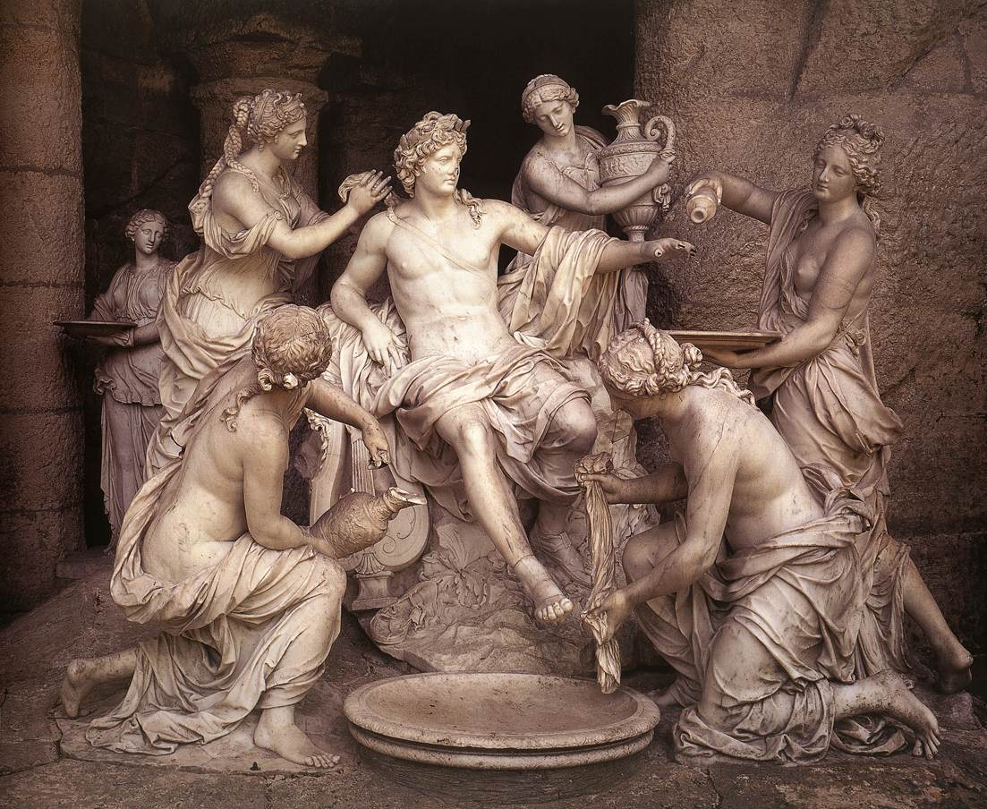
Entry 2: Ways of Seeing: Evolution or stasis? Representational relationships between men and women in art. Women in art are often inferior to men. This relationship is shown in the picture that was chosen. Apollo is being bathed by the 6 nymphs that surround him.

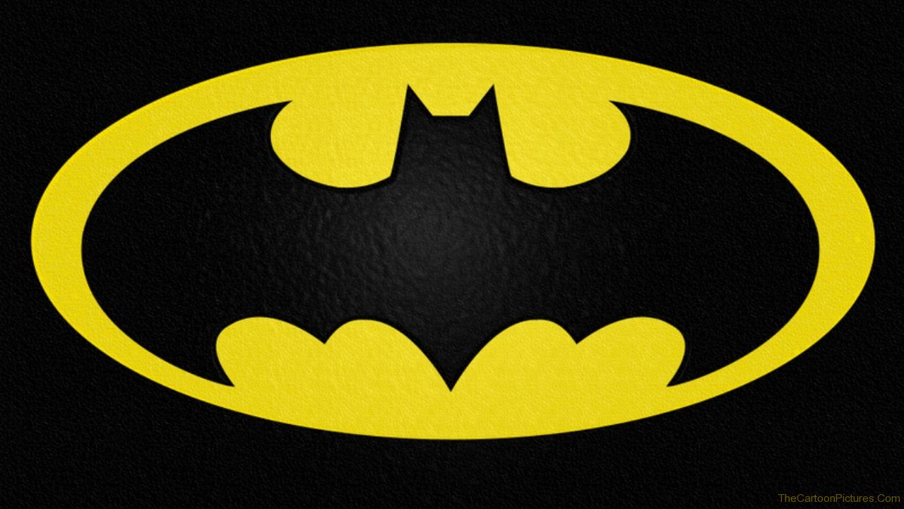
Entry 3: Gestalt Principles: Include two images that demonstrate selected (named) principles. Continuation and symmetry are the two gestalt principles that are analyzed in this project. The impossible stairs are an example of continuation while the Batman symbol shows symmetry in the simple design of the logo.

Entry 4: An Image that has shaped Western Culture: (or American culture). Choose one and explain. The image that was chosen is the German Swastika. This symbol has much history behind it. The Holocaust was one of the darkest times of world history and this symbol serves as a reminder of this time in history.

Entry 5: Symbolic nature of light: Static or “moving” image that uses light in a symbolic way. The picture that was chosen is an example of how light puts a different meaning behind a picture. This is a picture of a last meal on death row in Texas. This is a meal that a prisoner receives before their execution in jail. The lighting placed on this meal makes the meal seem gloomy and dark. If there was more light placed on the food, the meal would seem more positive.

Entry 6: Media Representation of Sight: Find an image of a visually-impaired person from a famous film or text. Explain. The man that is pictured in this entry is Ray Charles from the movie, Ray. Ray Charles was a blind pianist and vocalist. His sense of touch and hearing was inclined in order to supplement his lack of vision.

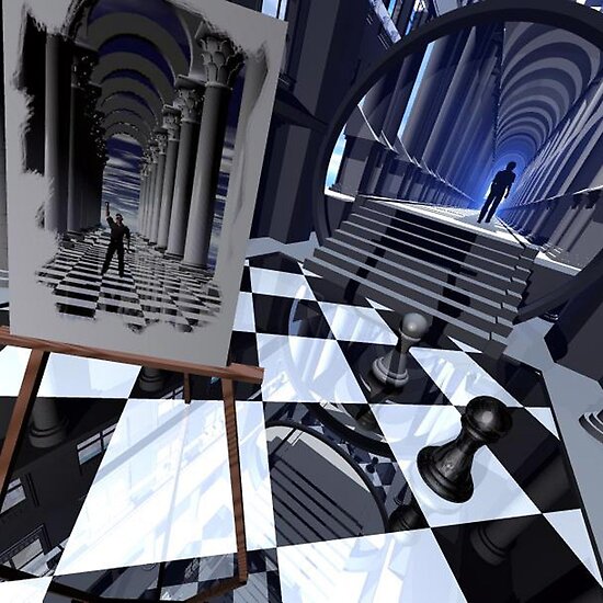
Entry 7: Visual Cues: Find an image that “exploits one of the four visual cues more than the others.” Analyze. The visual cue that is depicted in this entry is depth. This image plays with a person’s depth perception throughout this image. The mind infers certain things due to depth but this picture challenges the mind’s regular thought process with depth perception. This image deals with depth as a visual cue.

Entry 8: Advertising Social Causes: Analyze tactics in any advertisement for a social issue, health crisis, charitable cause, etc. Use print ads only. This advertisement sticks to a very simple and basic yet powerful layout. It uses pathos in order to get to your emotions to raise awareness about breast cancer. The pink color border and the position the woman takes as a ribbon helps this ad because these two are symbols of breast cancer awareness.

Entry 9: Stereotype Persistence: Find one powerful example in a business-related piece of visual media. The advertisement that is shown is a commercial for Old Spice Deodorant. This man gives off the impression that he is the “perfect” man in a woman’s eyes and gives false hope that her man can be “perfect” too if she purchases this deodorant for the man in her life. The stereotype in this ad is the man trying to be the stereotypical “perfect” man for a woman.

Entry 10: Technical Perspective: Based on your high degree of technical know-how about a certain media form, provide a visual example of a photograph, animation, graphic, or other image with “low production values.” Explain. The example given here is for the movie Paranormal Activity. This movie was a low production film. It seems to be filmed with a regular home video recorder. Since this movie is supposed to be based on true events, the home video recorder along with the poor production values gives believability to viewers.